
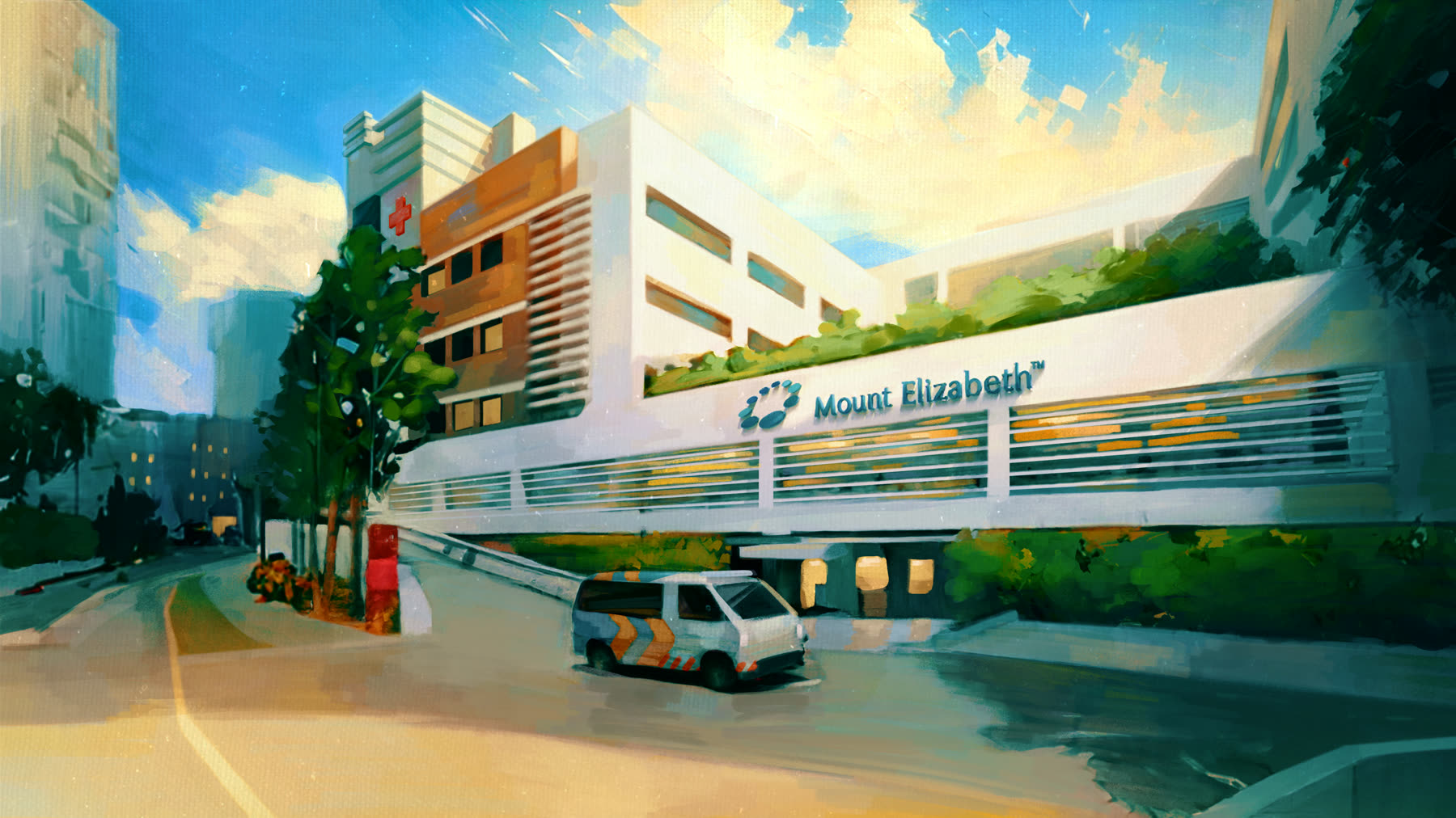
Mounth Elizabeth Hospital
Brand Story Video



Design that moves without a shoot.
Animated logos, kinetic type, data and interface motion, cut for every screen you publish to.
Superpixel designs and animates the graphic layer of your brand — logo idents, title sequences, kinetic headlines, animated charts and interface motion. Everything is built as artwork rather than footage, which means a change of copy, colour, language or aspect ratio is an edit, never a reshoot.
Trusted by





























Brand Story Video
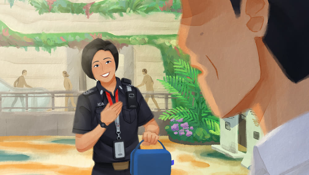
“Magic in Transit” Brand Campaign
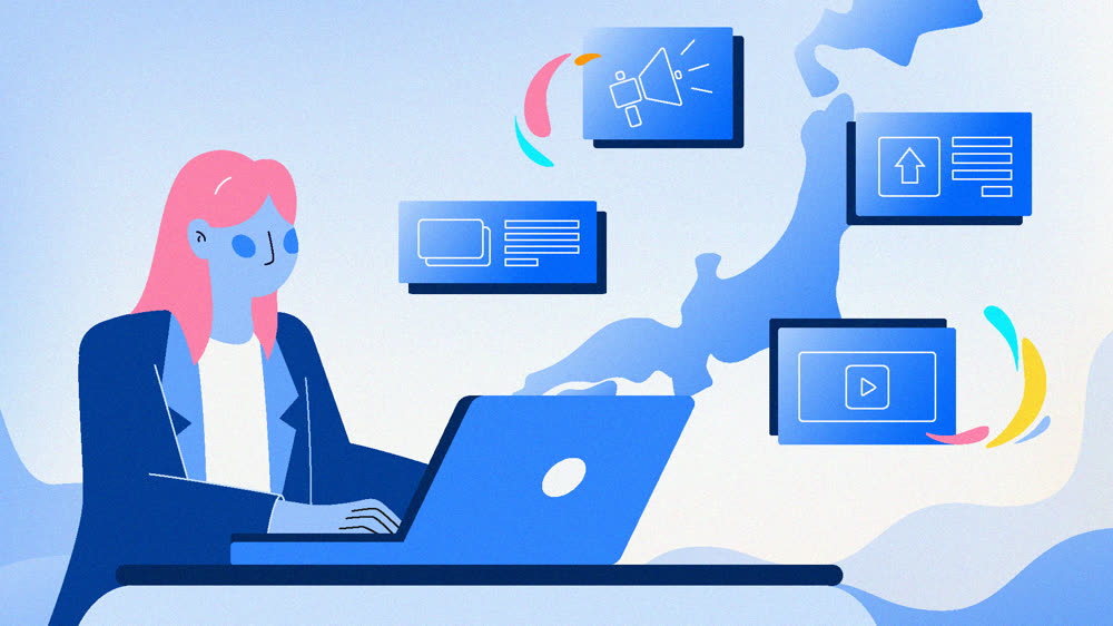
Product Animation Video
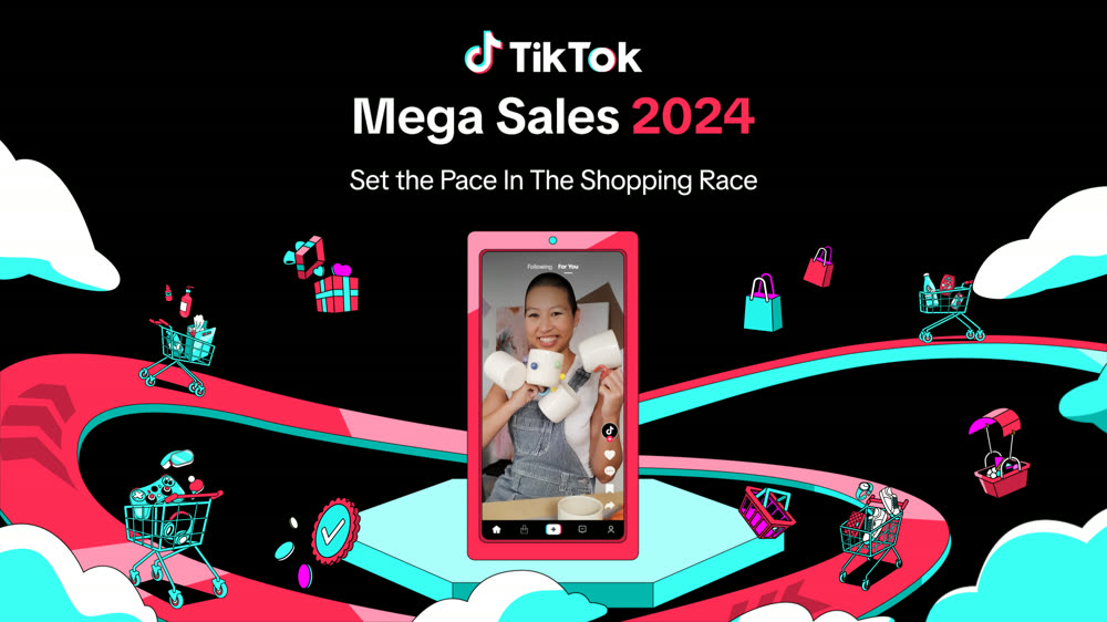
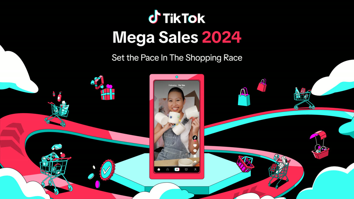
Mega Sales 2024 Campaign
Nothing in a motion graphics project has to be filmed. Logos, type, icons, charts and interface elements are drawn and then animated, so what you end up with is artwork you can keep working on — swap a statistic, translate a headline, reframe for a new placement, and the file simply updates. That is why it is the quickest route to on-brand polish: an ident at the front of everything you publish, a title card, a figure that explains itself, a feed cut that earns the three seconds it gets. Revisions are typically quicker here than in character work.
There is a line, though, and briefs cross it quietly. The moment a project wants an illustrated character, a mascot or a story with a beginning and an end, it has become frame animation — and we will say so rather than force the wrong technique at it. Our 2D animation team takes those. Put simply: motion graphics animates the brand system you already own; 2D animation gives it a personality. We have run both since 2015 across four studios on three continents, for brands including Changi Airport Group, Mastercard and Hilton.
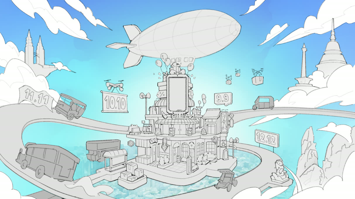
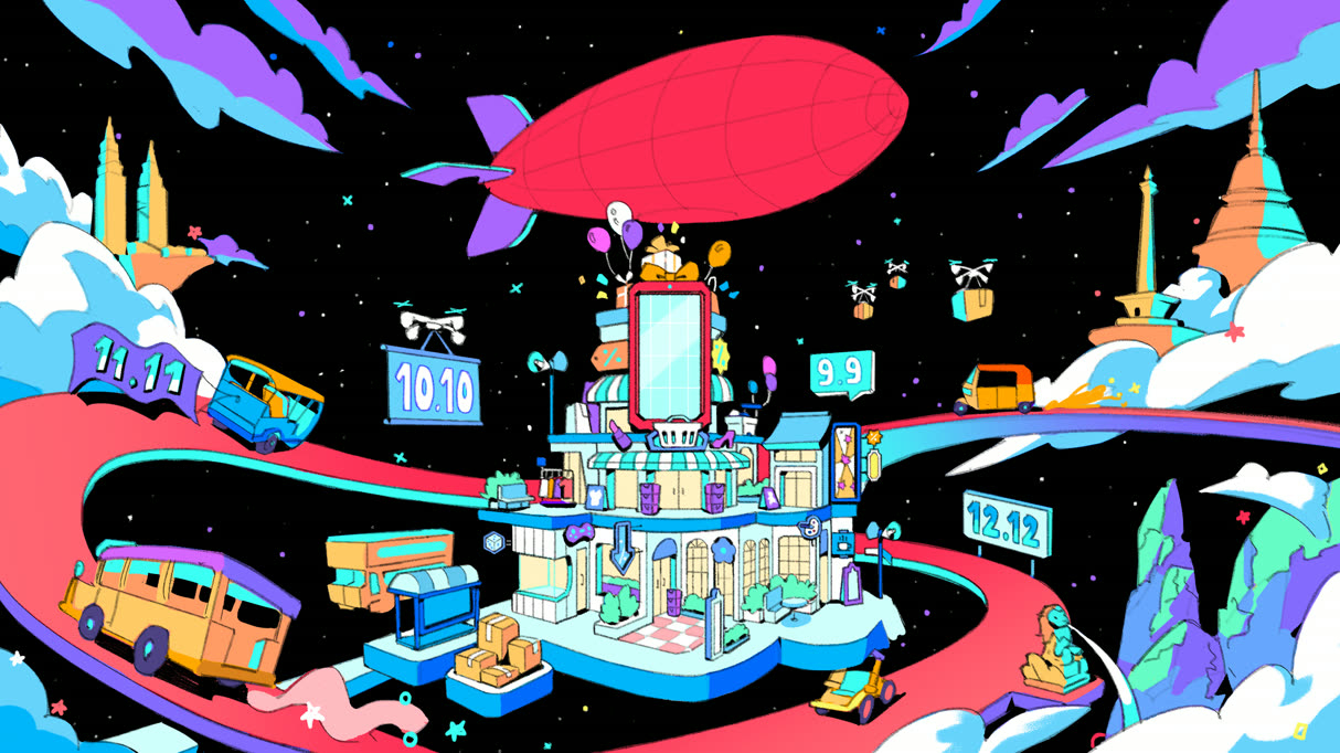
Five things brands hand us most often, usually a static file and a screen it has to survive on. Brief one, or brief the set and let them share a single motion language.
Figures, charts and process flows revealed in an order that argues your point, so a dense report gets across in half a minute.
Best For:
Investor decks / annual and ESG reports / product metrics / results comms
App walkthroughs, animated screens and product mockups that demonstrate how something behaves without booking a shoot or a screen recording.
Best For:
App demos / SaaS onboarding / product launches / feature releases
The three seconds at the front and back of everything you publish — a logo that resolves, an ident, a sting that becomes recognisable through repetition.
Best For:
Rebrands / show opens and end cards / channel branding / launch films
Lower thirds, title sequences, bumpers and short cuts mastered once, then reframed into every ratio a placement asks for.
Best For:
Broadcast and TVC / paid media / YouTube pre-roll / in-feed campaigns
Kinetic typography carrying the whole frame: a line, a script or a manifesto paced so it can be read in a feed with the sound off.
Best For:
Campaign lines / quote and lyric films / social captions / explainer hooks
A predictable five-step process. No surprises, no scope creep.
Brief, audience, message, success metrics
Script, style frames, storyboard
Illustration, animation, sound design
Two structured rounds of revision
Final files, cutdowns, captions
FAQ
That is the normal case rather than the exception — motion graphics is where a static identity finally gets to move, so your logo, typefaces, colours and iconography are the starting material. Where a brand has no motion language yet, we define one that reads as an extension of the identity instead of a departure from it, and hand it back as rules your other suppliers can follow. Brands including Changi Airport Group, Mastercard and Hilton have gone through exactly that with us.
We agree the message and the placement before anything gets drawn, because a vertical feed cut and a conference screen want completely different pacing. Design and storyboard follow, and that is where you sign off the look, the key frames and the timing. Only then do we animate, add sound and master the finals. The approval sits deliberately early, so nobody discovers a direction problem after the animation hours have already been spent.
Think in weeks rather than months for the majority of pieces. Three things set the schedule: how much finished runtime there is, how many separate deliverables come off it, and how fast sign-off returns at each gate — style frames, then animation, then sound and finishing. A standalone ident is quick. A campaign carrying several data sequences plus a full set of cutdowns is not. Tell us the live date and we will work backwards from it, saying plainly if any part of the scope will not fit.
There is no flat rate, because the variables are real: total runtime, how many separate assets you need, whether the style is designed from scratch or animated from an existing brand book, how much bespoke illustration or character work is involved, how many ratio and language versions come off the master, and how tight the deadline is. A single logo ident and a six-part data series are not the same job. Send the brief and we will scope it into a fixed, itemised quote rather than a band you have to guess at.
Whatever your channels ask for. Widescreen 16:9 for sites, YouTube and broadcast; vertical 9:16 for stories and reels; square 1:1 for in-feed placements — plus transparent, looping and lightweight web builds where a page or an interface has to carry the animation itself. Files arrive cut to the spec of the platform they are going to, so nobody on your side is re-exporting before it can go live.
Yes — most motion work is briefed, reviewed and delivered entirely online, wherever you are based. Frame-accurate comments, shared boards and versioned files stand in for the meeting room, and the spread of offices covers a wide band of time zones.
TESTIMONIALS
SuperPixel can be trusted to deliver creative animation work. Their experienced team is easy to work with, always available to guide us, and clear in managing project timelines and expectations. It has been a breeze working with them.

The event went smoothly, and it was a successful New Year's Eve celebration for us. Thank you, SuperPixel, for all the work and support you put into making it happen.
The work SuperPixel has provided us has been nothing short of great. Their revisions were spot on, and the final result matched what we had in mind. It has been a pleasure working with the team.

Really enjoyed working with SuperPixel, they are able to fully understand the creative needs of different projects given and deliver the animations accordingly. At the same time, the team is also very accommodating, clear and quick with their works.

The visuals were heartwarming and beautifully captured the story we wanted to share. It was a fantastic collaboration! The team's creativity and dedication brought our idea to adorable character, amplifying our message in a powerful way.
The animations enhanced our campaign! Delivering a polished and impactful message. The team's creativity and adaptability brought our vision to life effortlessly.
Send the logo, the deck, the dataset or the screen recording. We’ll come back with a direction, the right set of deliverables and a fixed quote.